Appearance
Common Controls
Evo.NET uses controls as building blocks into order to create the User Interface (UI). These controls provide a consistent experience to the user no matter what underlying data is being presented by them.
INFO
These is always some ambiguity between the usage of the word "component" and the the word "control" when used to describe a complex interface element. For the purposes of this documentation, we will use the word control to mean a complex, single-purpose user interface element, and component to mean a reusable collection of controls that may perform multiple tasks (see Common Components).
DataGrid
A complex control, packing a ton of features.
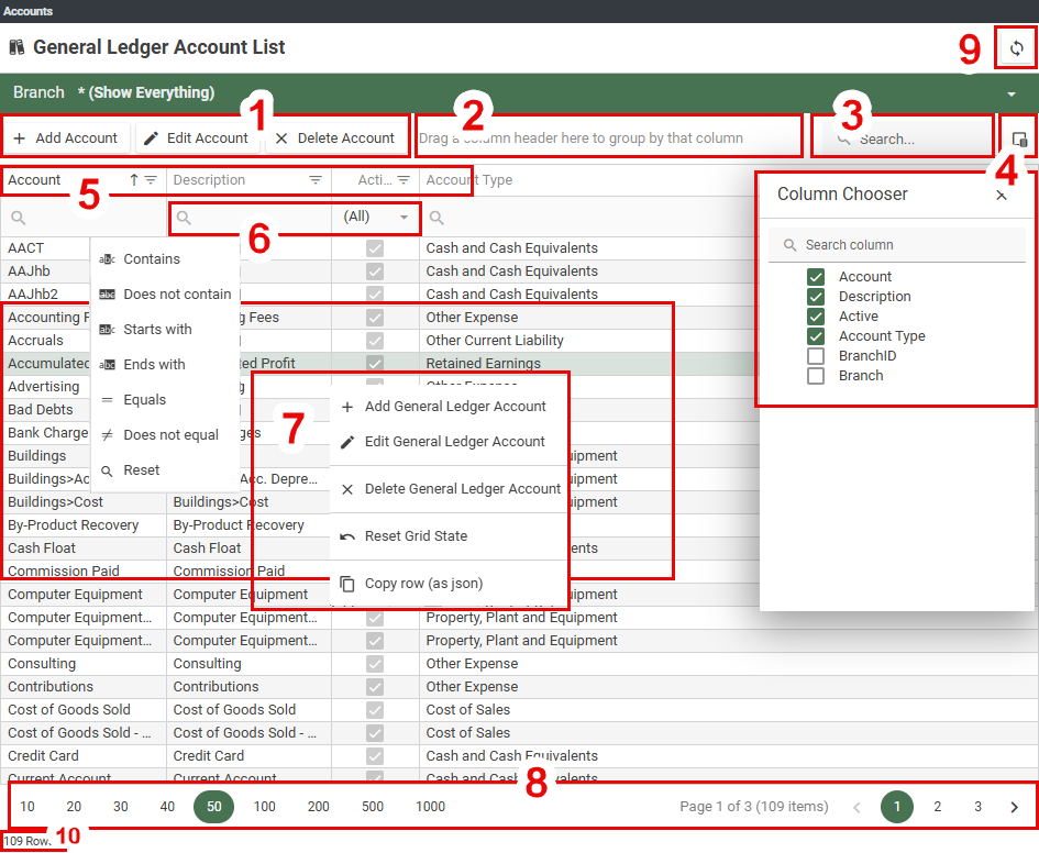
1. Toolbar
Buttons to invoke functions will appear here. They may become enabled/disabled depending on the current data row selection.
2. Column Grouping Area
Drag a column header into this area to group by that column.
3. General Search
Type text to search for in this box. This will search all data (not just current page) in all visible columns in the grid, and then filter only rows that include the search string, highlighting all found instances in any column. Click the x in the textbox to clear the search text.
4. Column Chooser
Click this button to pop up a list of available columns. Check each column that you would like to see in the grid and uncheck those you wish to hide. If the list is long, you may want to enter search text in the box provided to filter columns by name.
5. Column Headers
Column Headers display the caption of the data column, but are also interactive. Click and drag a column to move it to a new position or group by it. Click on the separator between column headers and drag to resize the width of a column. Click once and release to cycle the sort order of that column: ascending or descending (if other columns were sorted, their sort order will be cleared). Hold Ctrl while clicking to clear the sort order, or Shift to add this column to any other currently sorted columns (secondary sort). Click the Filter icon  to open a list unique values found in a column and check any you would like to filter.
6. Column Search
Type text into this box to filter a column by that text. You can choose the operator that is applied by clicking the grid column search operator button  to open up a menu to pick an operator or to clear the previous selection. The search will search the column in all rows, not just the current page.
7. Context Menu
Right-click a data row to open up a context menu. This may include
7.1 Buttons that are on the toolbar for easy access.
7.2 Reset Grid State option. This will immediately revert the grid back to its default settings: visible columns, column widths, column sort orders, pagination defaults.
7.3 Copy row (as json): this will put the entire selected row as a structured data object onto your clipboard. Note, it is usually possible to drag-highlight row text and copy just that as normal.
8. Pagination Controls
When the grid default scrolling mode is set to paginate and the number of rows exceeds the page size threshold, this control bar will appear below the grid.
The numbers on the left are the options for the page size with the current selected page size highlighted. Click on a number to change the page size.
Information about the grid's current view is presented in the middle: the current page and how many pages there are, along with the total number of rows. Note: this is the current filtered rowcount/pagecount, not the total of all data.
A selection of page numbers is displayed on the right, possibly condensed, where the current page can be changed by clicking on next/previous or a specific page number.
TIP
You may click the "1000" page size button and then, because you have fewer rows than that and the grid will remember your selection, the pagination control bar will disappear and you will never see it again. To get it back, you will need to select the option Reset Grid State from the context menu which will restore the default pagination settings.
NOTE
If the the grid default scrolling mode is set to virtual, you will never see the pagination control bar as the visible display is managed by the grid and optimised to render only what is visible in order to be as efficiently as possible.
9. Data Refresh
If this button is available, it is a much better option to use it when you wish to refresh the current data view as your browser's Refresh button will cause a complete site reload.
10. Row Count (Total)
If this display is present, it will show the count for all rows, regardless if any filter has been applied by the grid.
NOTE
The grid will remember EVERYTHING, not just column positions and widths, but also filters, sorts and search texts. You will need to clear them individually when you no longer need them, or Reset Grid State to clear everything and revert to the default state.
PRO TIP
The grid columns will naturally stretch to try to fill up all the horizontal space available, but if there are more columns and data in the columns than can fit in the window, the grid will extend beyond the window and a horizontal scrollbar will be available to drag which will scroll the grid sideways. If you Shift+MouseWheel, you can scroll the grid horizontally without having to find and drag the scrollbar.
Lookup Combos
A lookup combo, or combo box, is a text edit box with down-arrow button which will drop-down list of choices. The text editor text is usually editable, in which case typing some text into it will filter the choices in the drop-down and a value can be selected which will then set the applicable field value. Use Alt+Down to pop open the drop down list, then up/down-arrow and Enter keys to select a value with the keyboard or click on a row in the drop down list.
If the value to be selected is an entity Code, the filter functionality will apply a Starts With filter to the available values. If you are choosing an entity Description, such as a Stock Item description, the filter may apply a Contains filter operation using the text you have typed in order to help you find the item you are looking for.
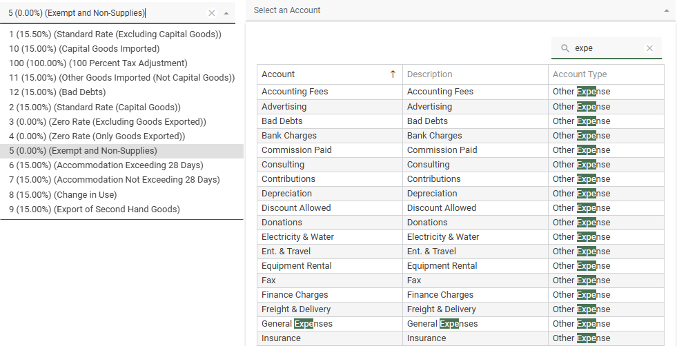
Some combo boxes, such as the General Ledger Account lookup or Customer lookup will present a full DataGrid when dropped down. These combos will not accept filter text to be typed in them, but instead will drop down immediately and focus the input into the datagrid's general text search box which will apply a Contains filter to all columns. In some cases, such as if you are using Segmented GL Accounts, the datagrid will further allow column filters to be applied so that an individual Segment may be filtered.
Click the (x) button in a combo (or the Search box) to clear your filter/selection.